Past Blog Layouts
Ever wonder what my blog used to look like? Want to see what a crappy designer I was in the beginning? Well, today is your lucky day! (HINT: The best ones are at the bottom.)
VERSION
1: EWWW ICKY ICK
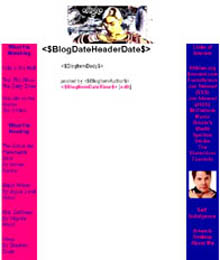
This is
my first blog ever. Can we say barf? The color scheme isn't too bad, but
the graphic at the top sucks eggs and the spacing was just horrible. I
did this on my old computer with a 600 x 800 screen using only three tables,
so I'll bet you can imagine how horrid it looked when I opened it on my
1200 x 1600. I fixed it up a bit so that it's presentable for this section,
but somehow it still sucks. But I was just starting out in the design
world. There would be better things to come.
VERSION
2: NAKED CHICKS
Ah, much
better. Sort of. I used some images from Tony Stone with Photoshop to
make what I thought were cool graphics. Too bad the rest of the layout
sucks. I was still struggling to make my layouts look the way I wanted
them to. In fact, I think it took me two or three days to get this one
up simply because it kept looking wrong on my browser. Oh well, live and
learn.
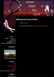
VERSION
3: SELF-PORTRAIT
As you
can see, I eventually learned how to design a decient page. This is the
result of fiddling around with a self-portrait I had made in Illustrator.
The colors and layout just magically came together. This is one of my
favorites because it actually turned out pretty much the way I imagined
it in my head.
VERSION
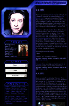
4: YAY, IT'S JON STEWART!
I found
an absolutely georgous picture of Jon that was screaming to be featured
in a layout. So, of course, I put it on my blog. I like this one 'cause
the design is so simple. You know what? I should go back to designing
simple things again . . .
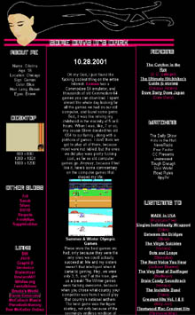
VERSION
5: TRIBUTE TO GEORGE
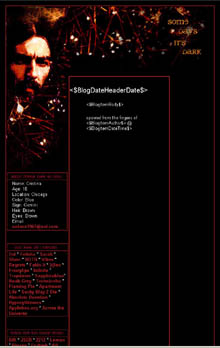
The death
of Gorge Harrison was quite a shock to me. He was such a quiet, peaceful
man, and made such beautiful music. And that is all.
VERSION
6: WE LOVE DISCO
This one
was inspired by the groovy Paul Bellini song, We Love Disco.
I was playing around with a disco animation in Flash for a class, and
decided to use some of the graphics in a blog layout 'cause they looked
pretty. Plus, I love disco. Who doesn't?
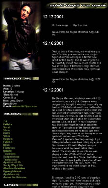
VERSION
7: FOR THE LADIES
Yes,
it's Jon Stewart again. As soon as I saw that picture in People magazine,
I knew I had to put it in a place where I'd see it every day. This layout
took me the longest to create, just because I wanted it to be absolutely
perfect.
VERSION
8: GOTHIC. SORTA.
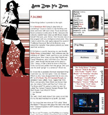
I found
the picture of the chick in an old Spin magazine, and thought it looked
kinda neat. After fiddling about with the color scheme, I finally came
across something that worked, so I tried to build a layout around it.
The end result didn't come out exactly as I had planned, but I'm still
satisfied.
VERSION
9: BLUE 1968 BEATLES
I wanted something that popped
out a bit more than usual, so fiddled around in Photoshop until I achieved the effect I was looking
for. I then picked out a few pictures of the Beatles from their 1968 "Mad Day Out" and fited them
into the top of the layout.
VERSION
10: JOHN & PAUL
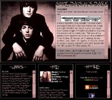
Lennon and McCartney were (and still are) the greatest composers - ever. This layout celebrates their companionship. Ewww, no, not like that.
VERSION
11: HOLIDAY PROGRAMMING
You ever notice how there's nothing on TV during the holidays? As an avid TV-watcher, I made this layout to commemorate the lack of quality holiday promgamming, as well as my lack of holiday spirit.
VERSION
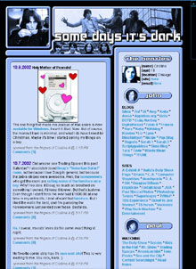
12: SOAPY
I was getting a bit tired of all the dark, depressing layouts, so I decided to try something more cheerful. The result? Yellow, a soap container, and soap suds. Yay!